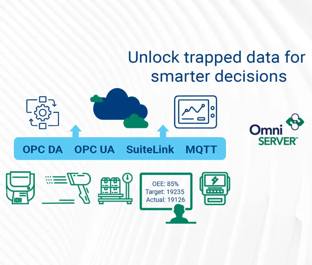
You may have heard about the latest OmniServer released in October – OmniServer V3.0. OmniServer V3.0 includes enhancements to licensing and support management, as well as, several usability enhancements to the configuration interface including a new topic wizard and updated Configuration User Interface.
The first in a series about specific V3.0 features - this blog post will detail one of those usability enhancements - the updated Configuration UI - designed to increase your efficiency and the ease of finding settings and components when you're working with OmniServer to integrate your non-standard process devices.
 For a new user, the user interface enhancements in OmniServer V3.0 will feel very intuitive and like they've always been there. Existing users will find the enhancements very user-friendly and will appreciate the thought that's gone into increasing productivity by making everything easier to find and easier to configure.
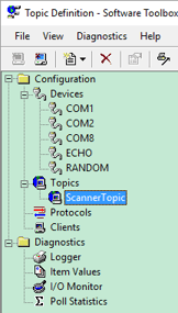
When looking at the Configuration user interface in OmniServer V3.0, notice the left-hand side of the window. There is now a tree view for all of the separate sections of settings and even diagnostics. Tired of reading? Ready to try it firsthand - click here!
You'll notice that for Devices, Topics and Diagnostics sections, you can expand to expose the individual topics, devices or diagnostic tools available for that section right in the tree view. In and of itself, that may not seem like a huge improvement, but if you've been working with OmniServer for over 10 years like I have, the incremental amount of time this saves over time adds up after awhile.
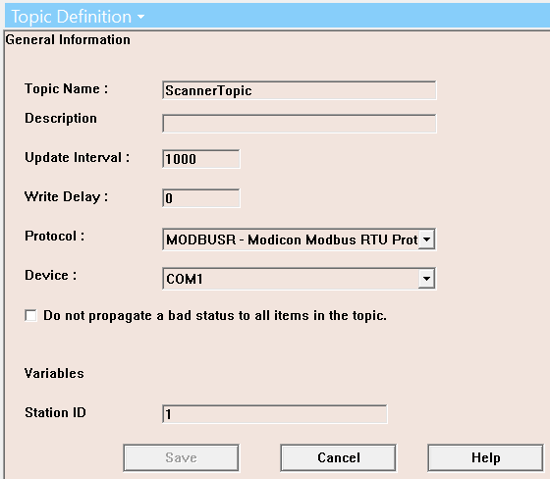
And for Devices and Topics, efficiency goes one step further. Selecting an existing device or topic displays the settings directly in the right-hand panel for any changes you need to make, as opposed to having to open a properties window for each object. This contributes to more efficiency when you're making edits to your OmniServer configurations, as you no longer have to open and close properties dialogs to change each object.
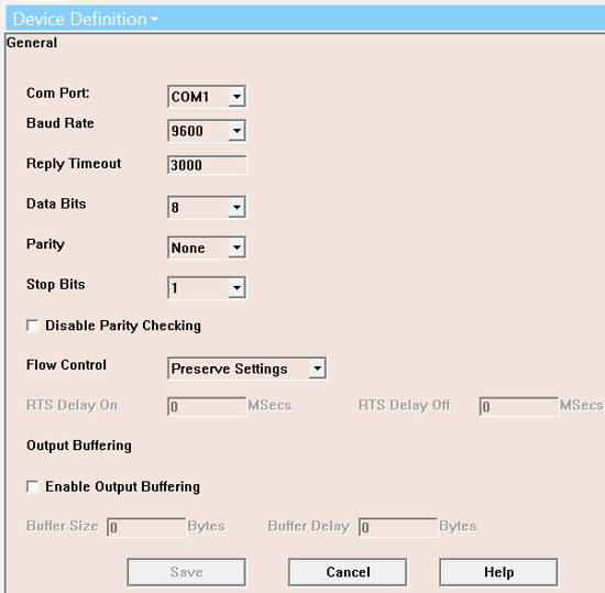
And even the device and topic properties themselves have been streamlined. Previously, when you had to open a properties dialog to edit a device or topic, there were also separate tabs or sections to switch between when adding or editing. Now, all settings are displayed in one unified view in that right-hand pane so that you have the big picture of your settings for that object and it's not easy to forget to configure something, such as a topic variable in the topic settings (which has always been a common omission when configuring a topic using a protocol that takes advantage of topic variables).
For troubleshooting, either during the protocol creation process or after, having your diagnostic tools such as the I/O Monitor and Logger in a more easily accessible place gets you troubleshooting faster and your issues resolved more efficiently.

All of these new user interface updates add another level of ease-of-use along with improved efficiency. If you're interested in learning more about the other features introduced with OmniServer V3.0, check out the OmniServer website and follow our blog for additional posts on those features in the coming weeks. Or, have a look at the full release notes - click for details.
Ready to see OmniServer V3.0 in action? Click below to get your free trial version!


